Introduction
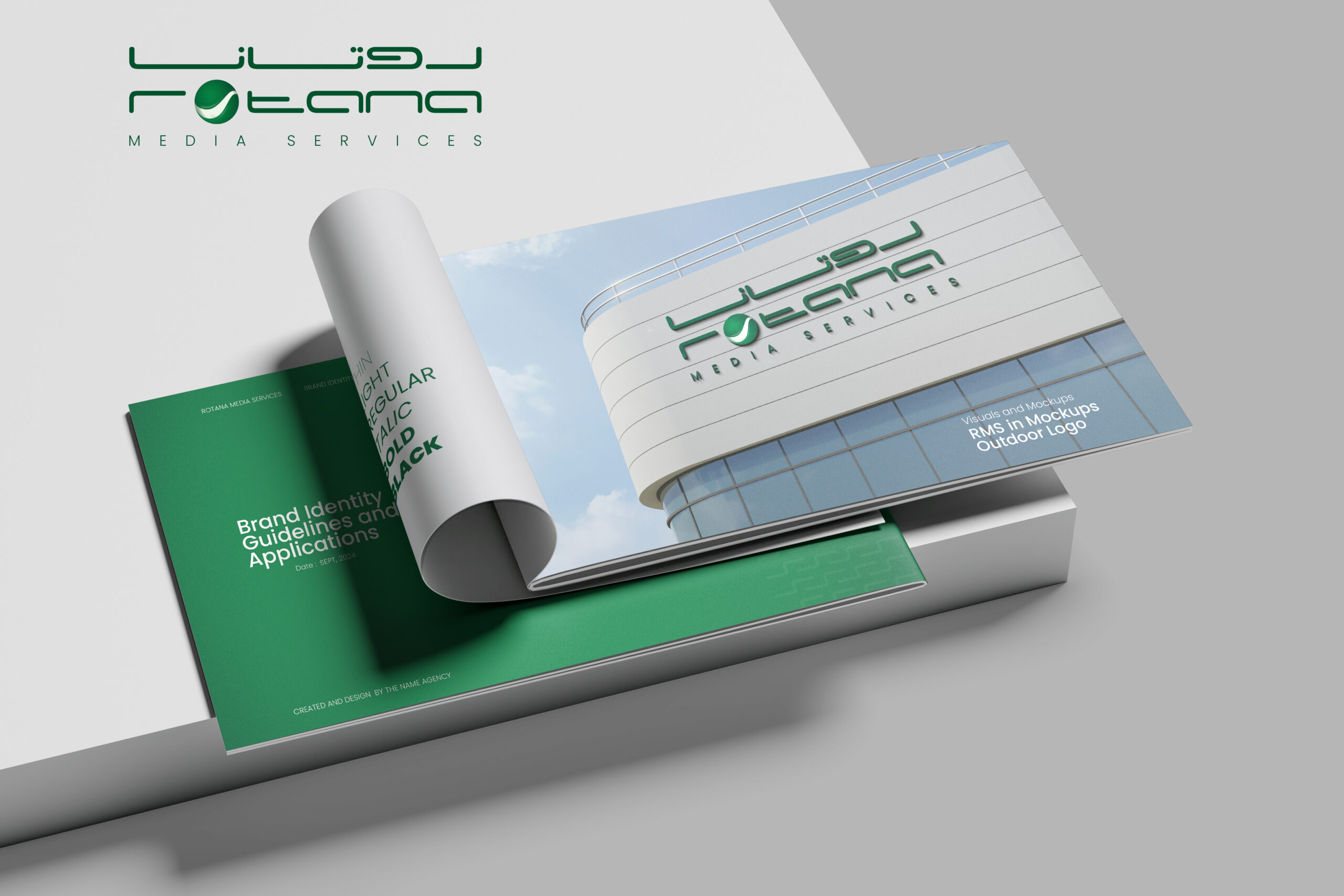
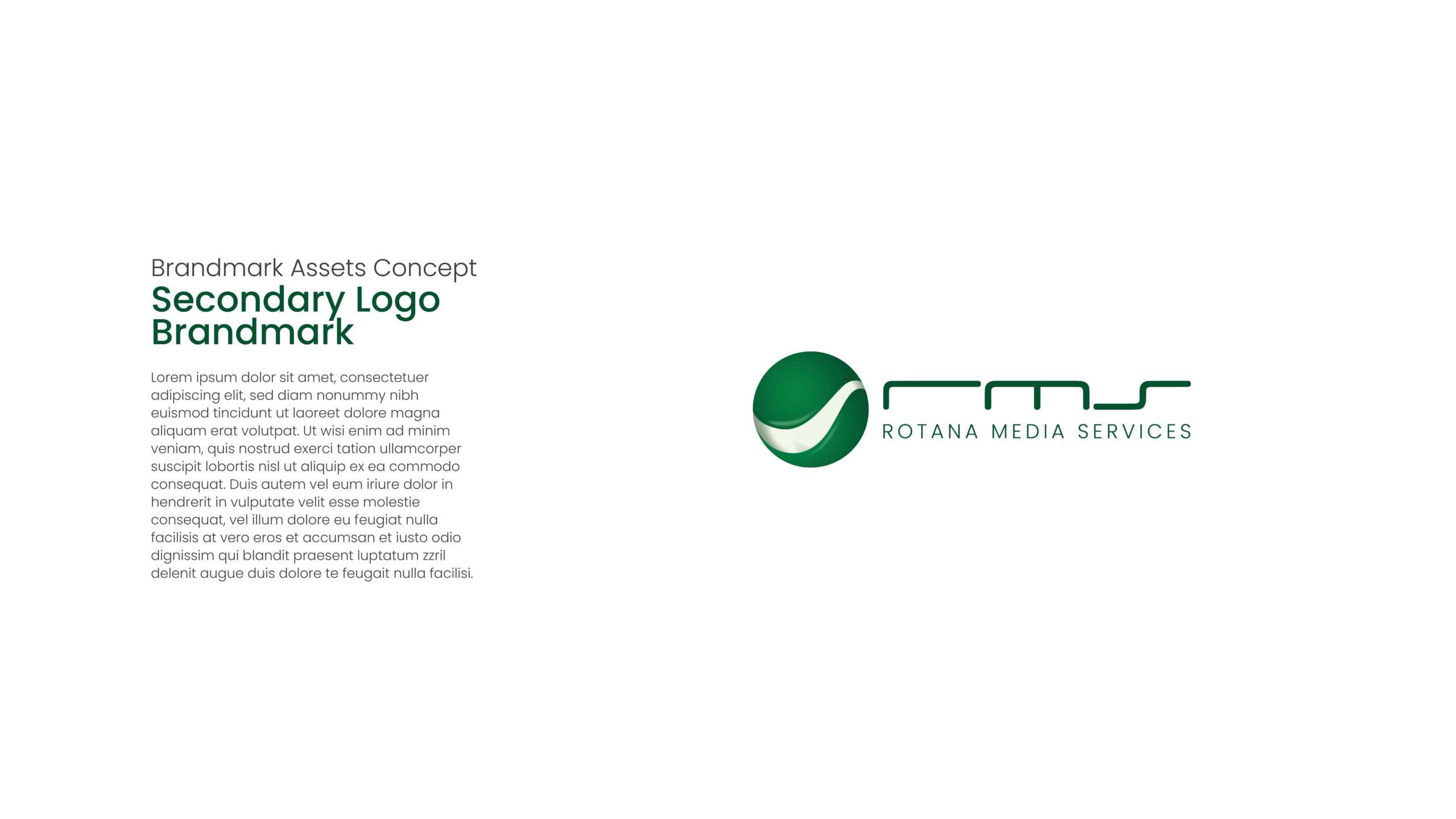
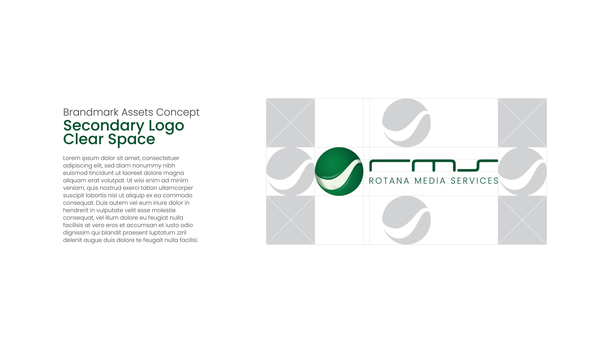
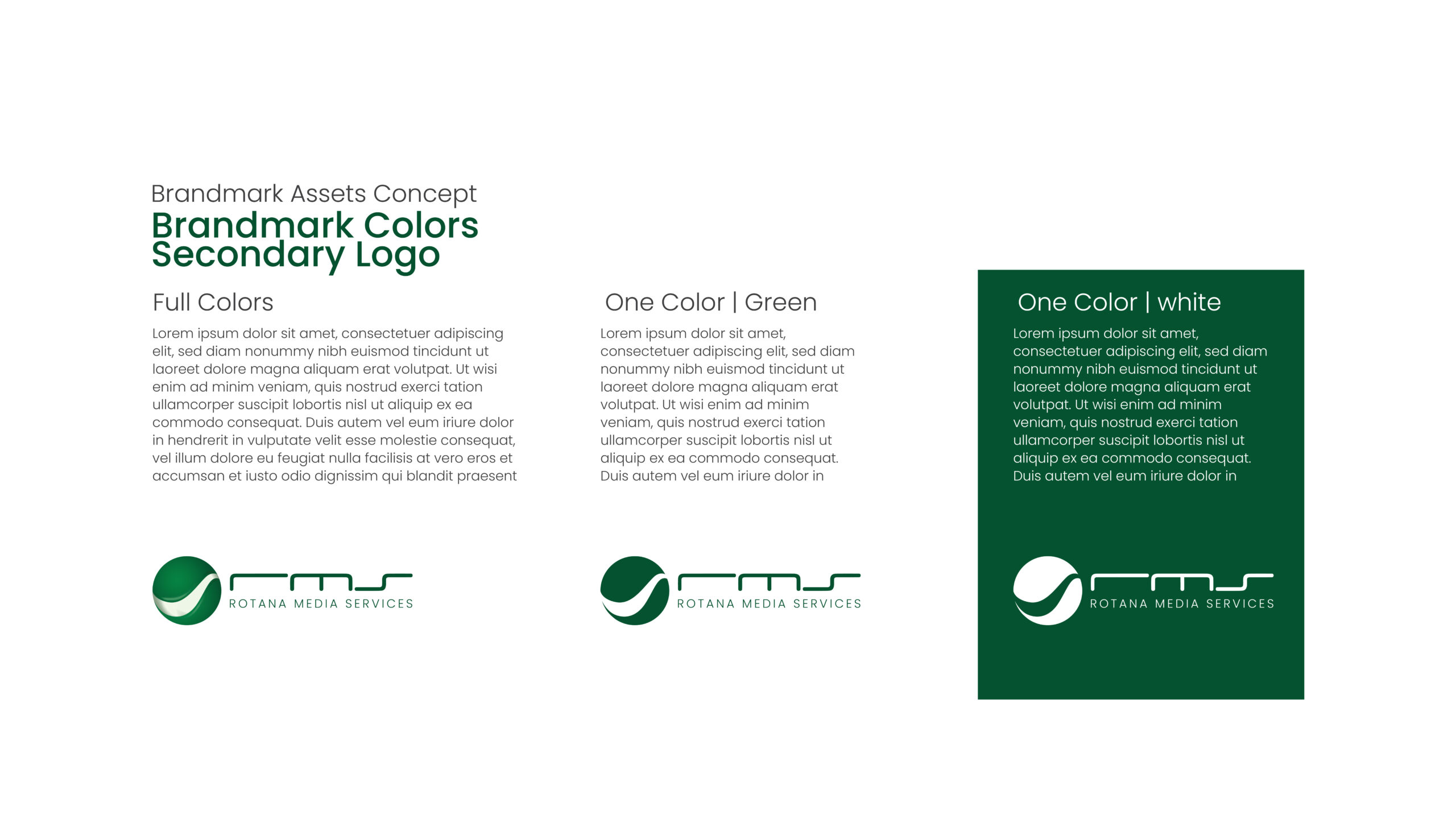
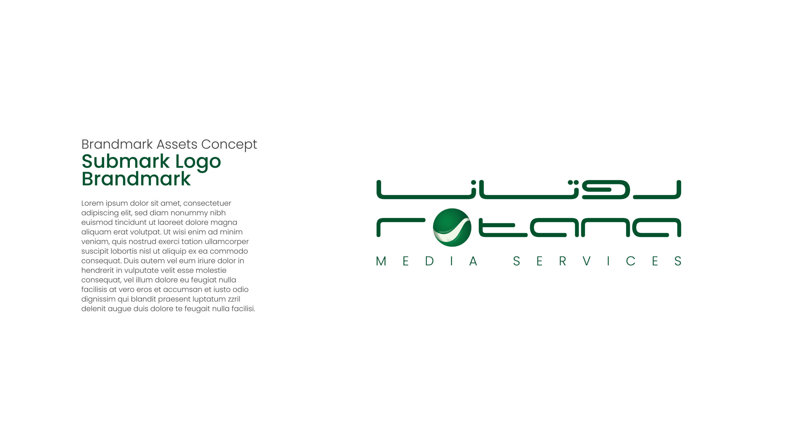
RMS ReBranding is a refreshed visual identity designed to modernize the brand while preserving its core values. This project redefined RMS’s logo, typography, and color palette—ensuring the brand feels contemporary, cohesive, and ready for a bold new chapter.
⸻
Design Process
• Research & Discovery – Investigated the brand’s history, audience perception, and industry context to inform the rebrand direction.
• Concept Development – Explored multiple visual paths through moodboards and logo sketches to redefine RMS’s identity.
• Refinement – Collaborated closely with stakeholders to refine visual elements—typography, colors, and logo treatments—for clarity and impact.
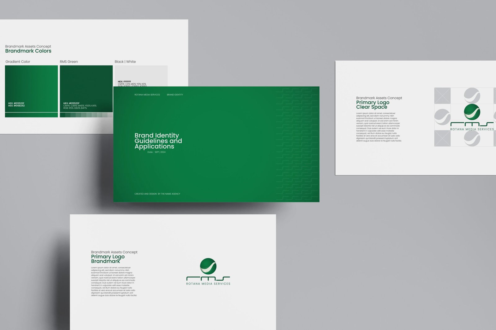
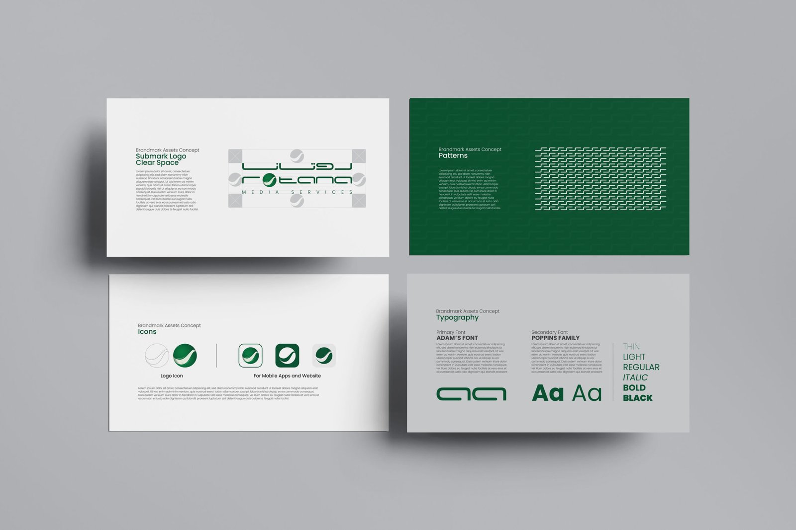
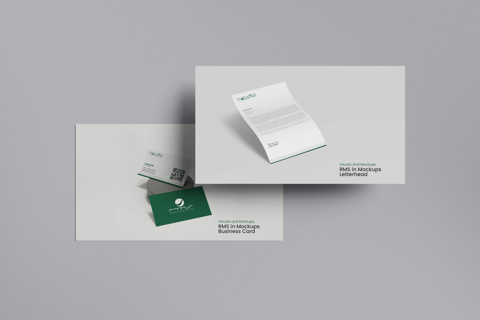
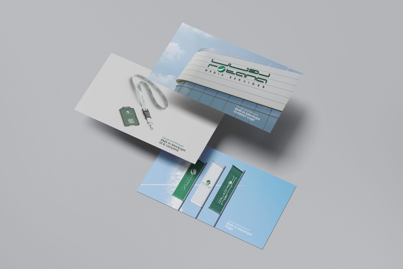
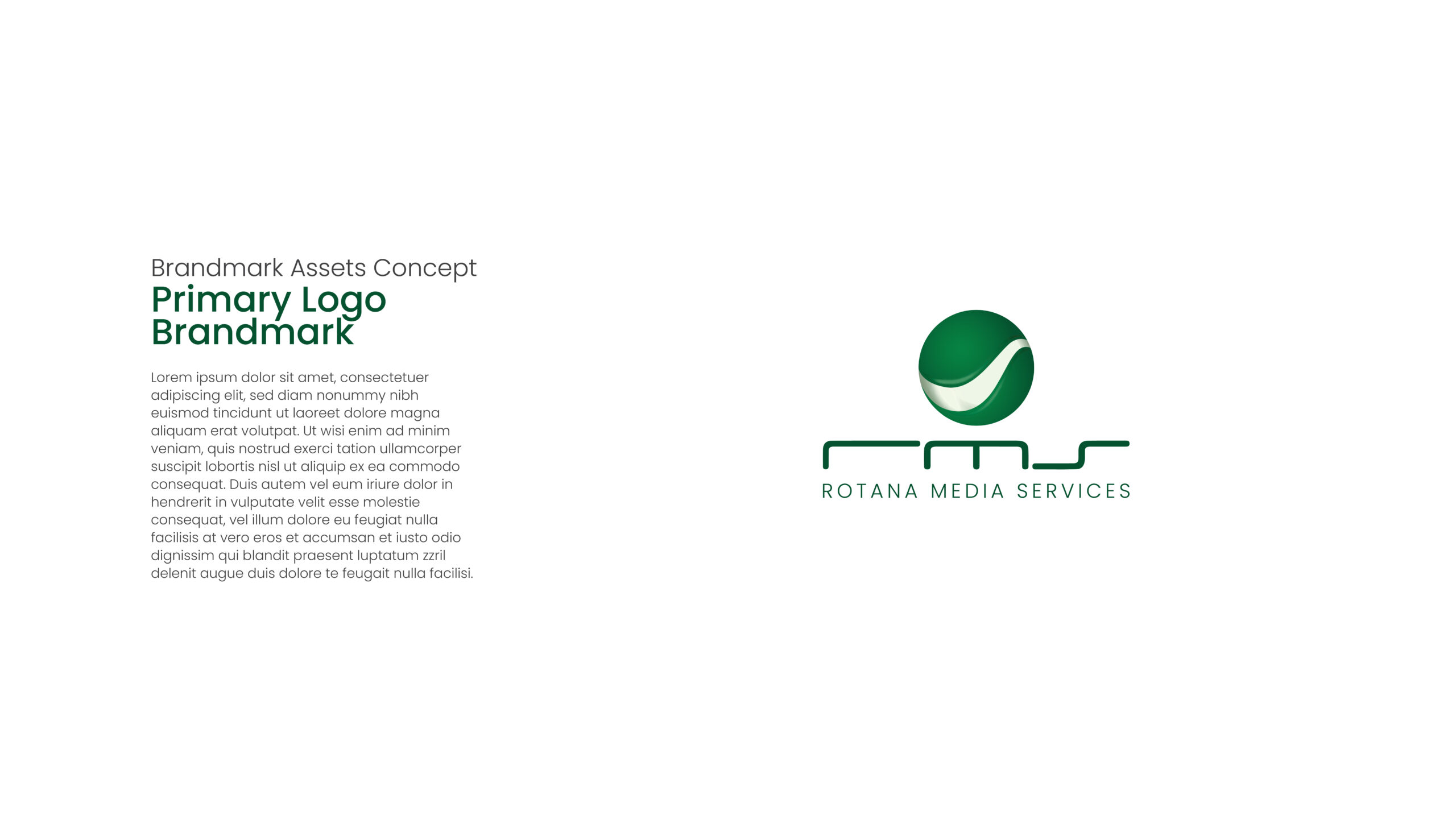
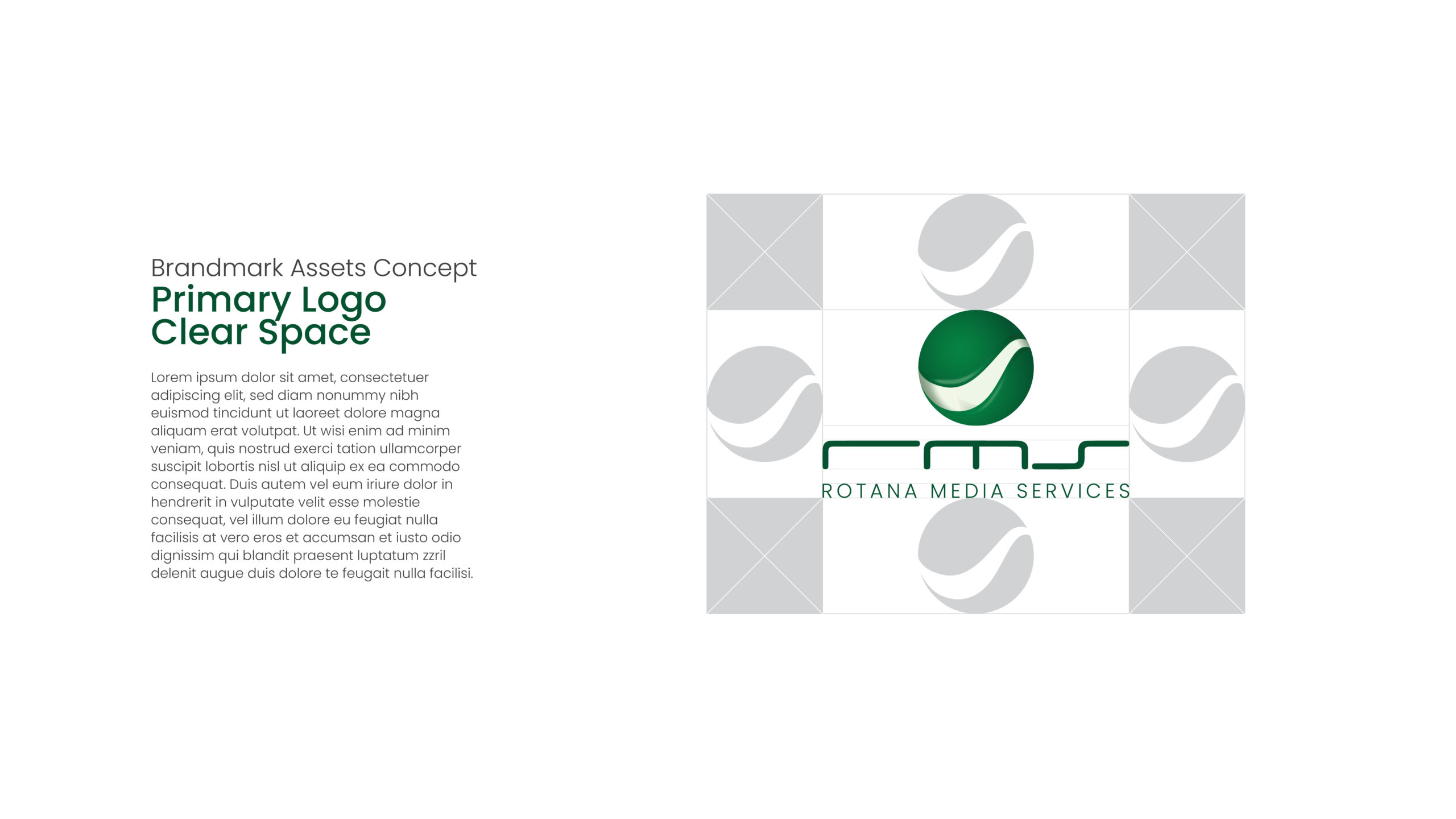
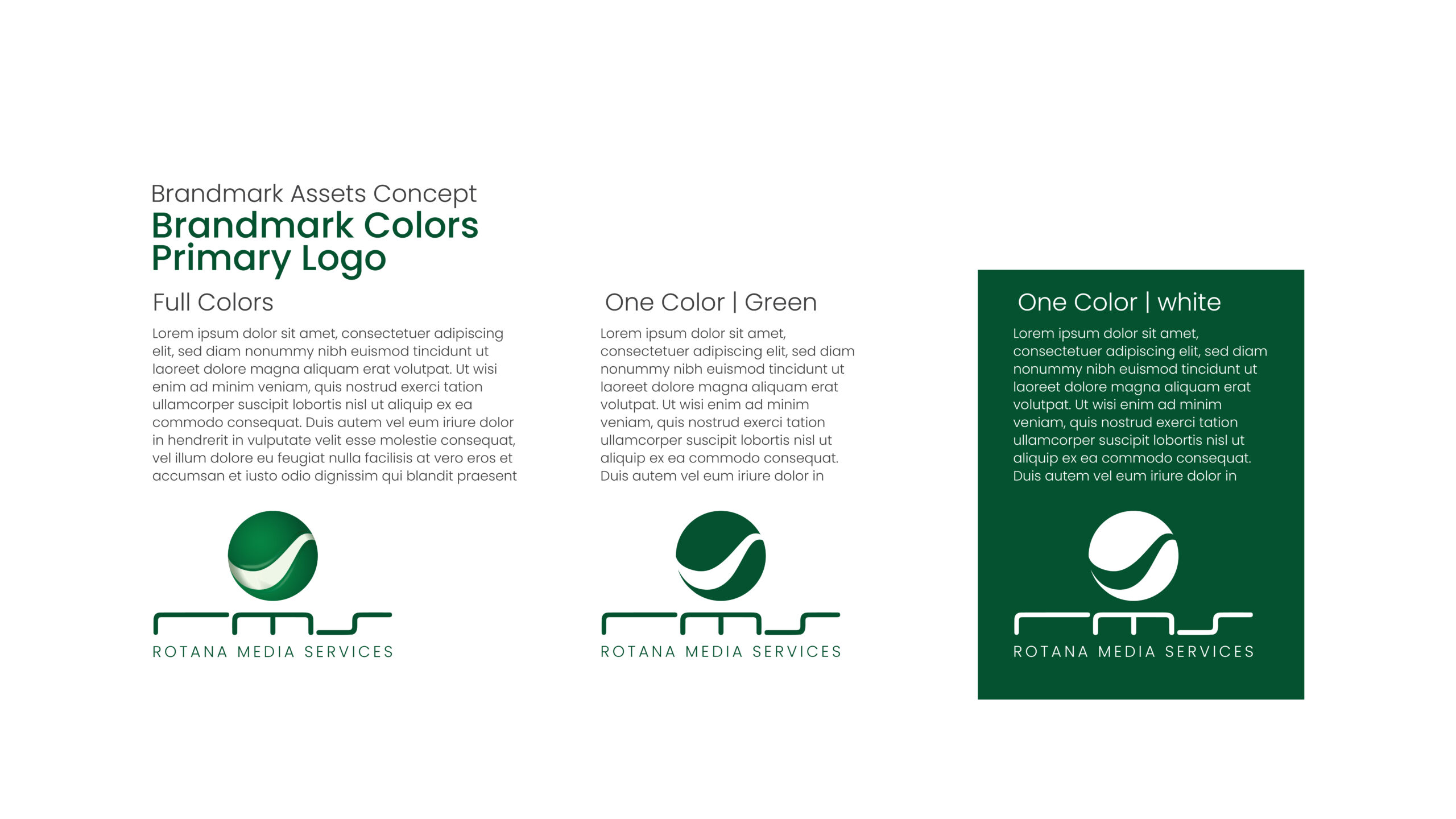
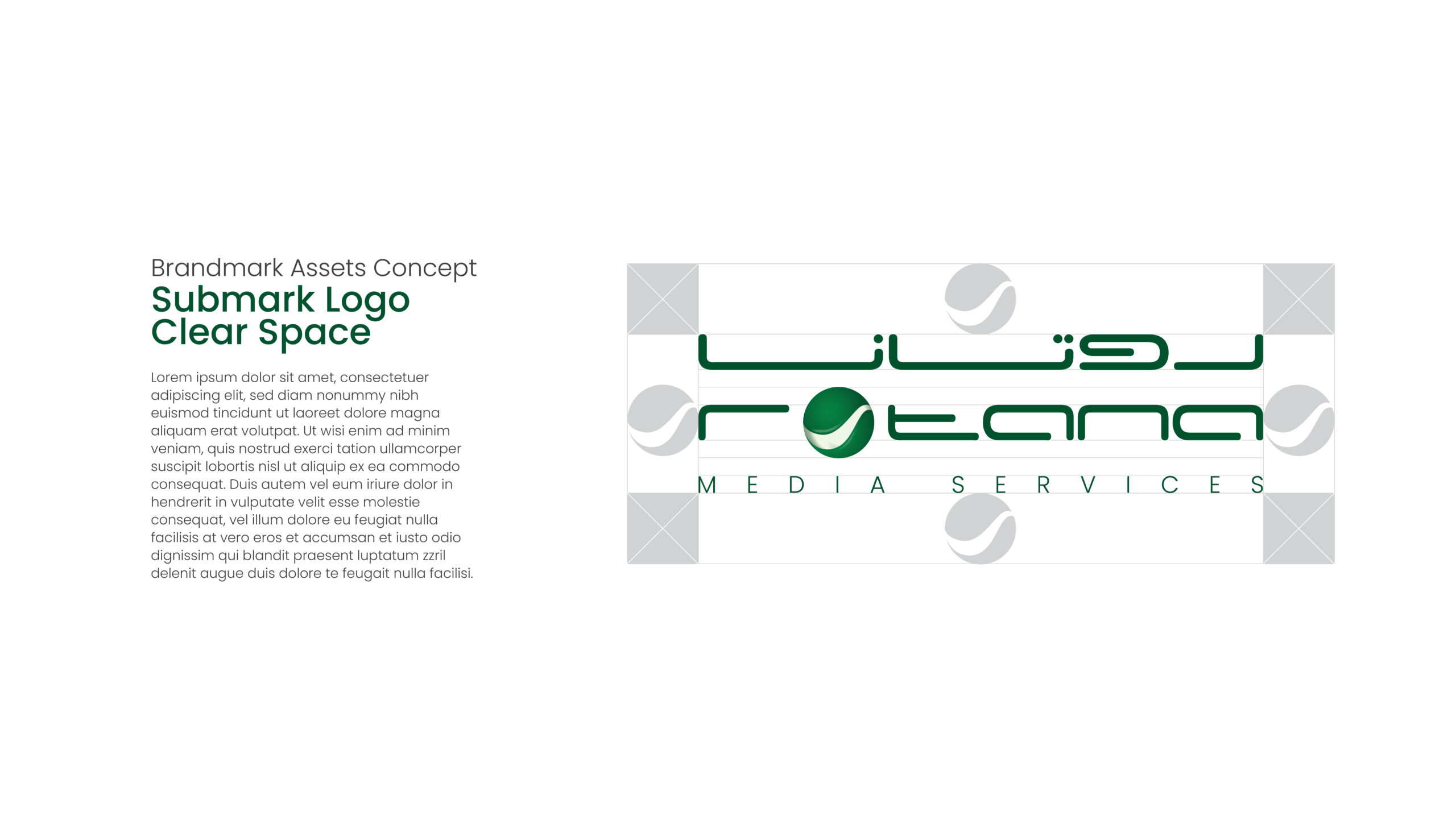
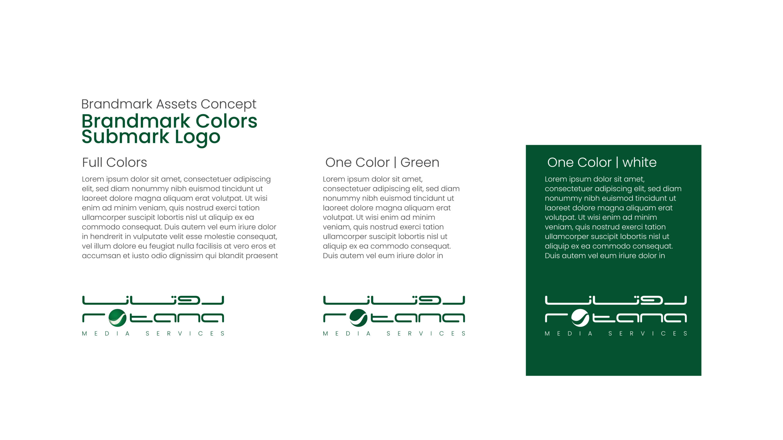
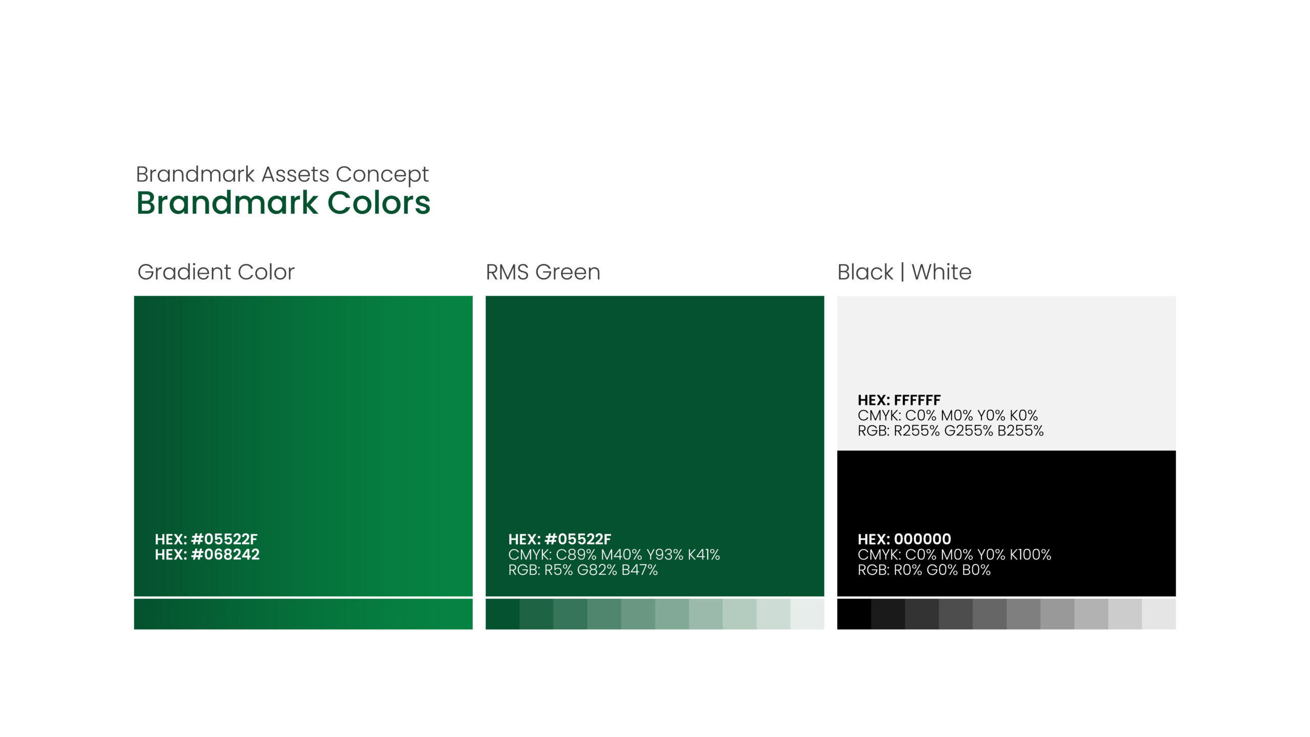
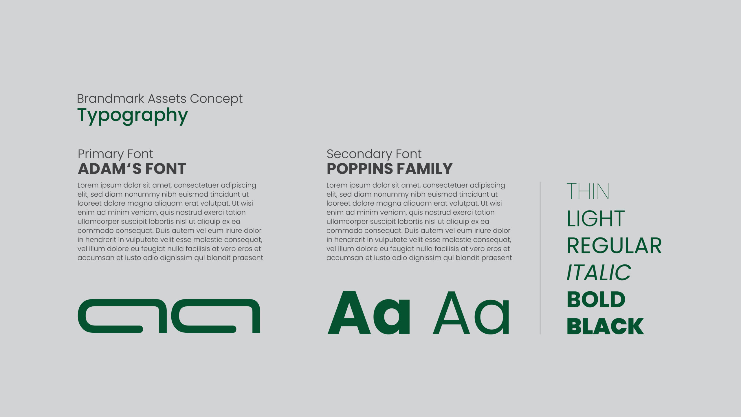
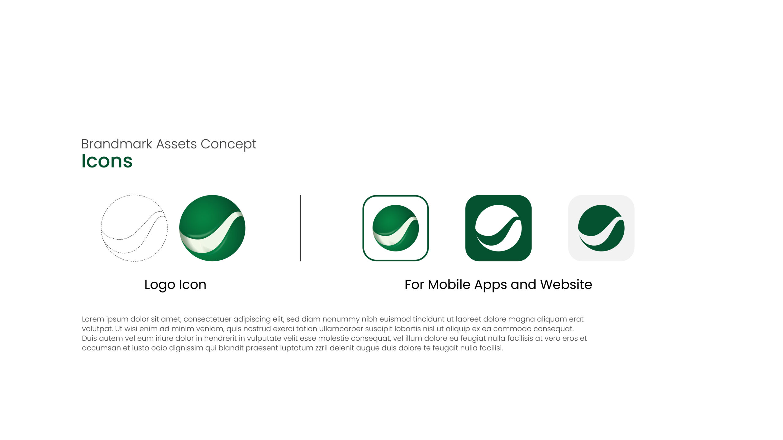
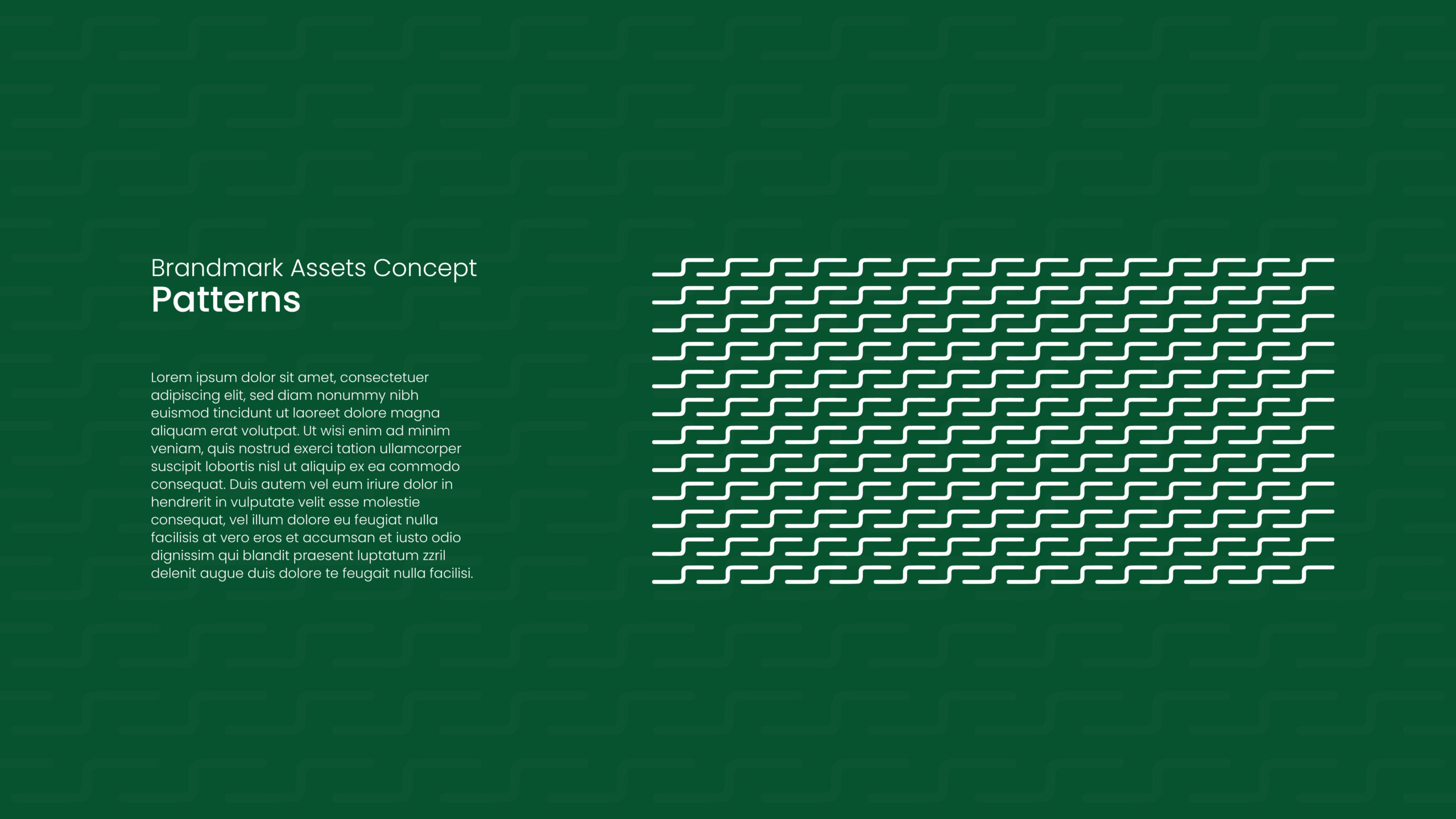
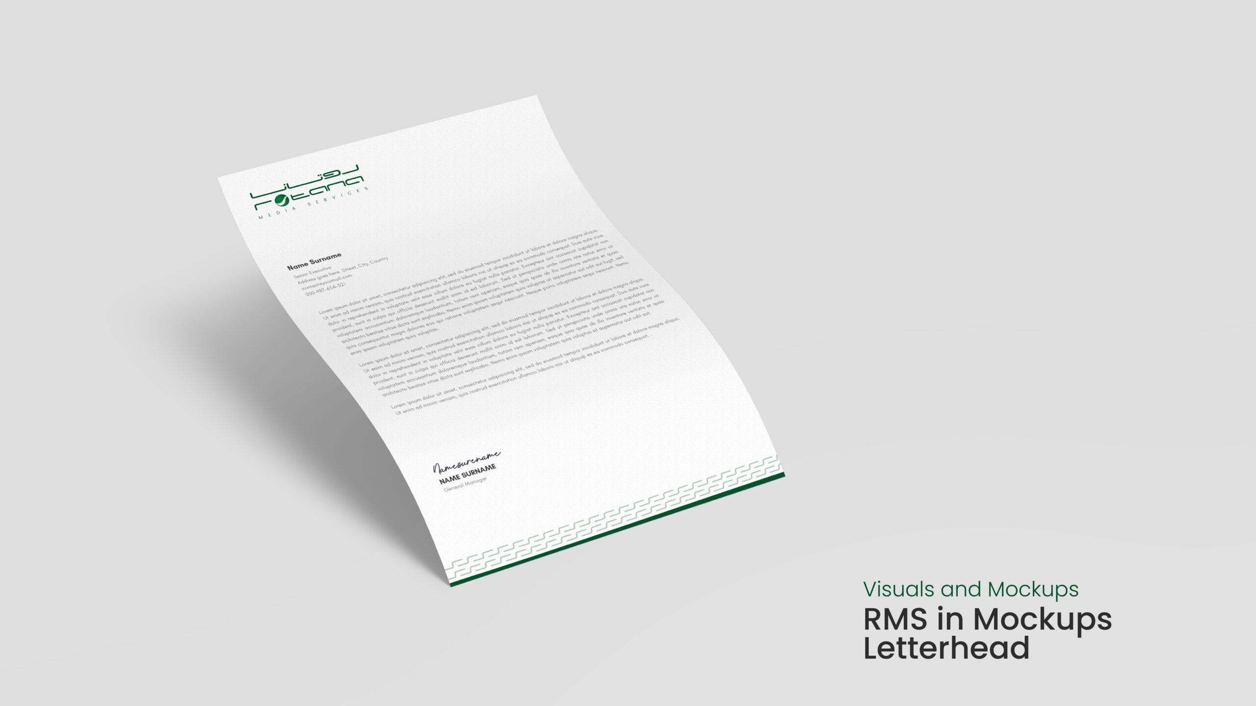
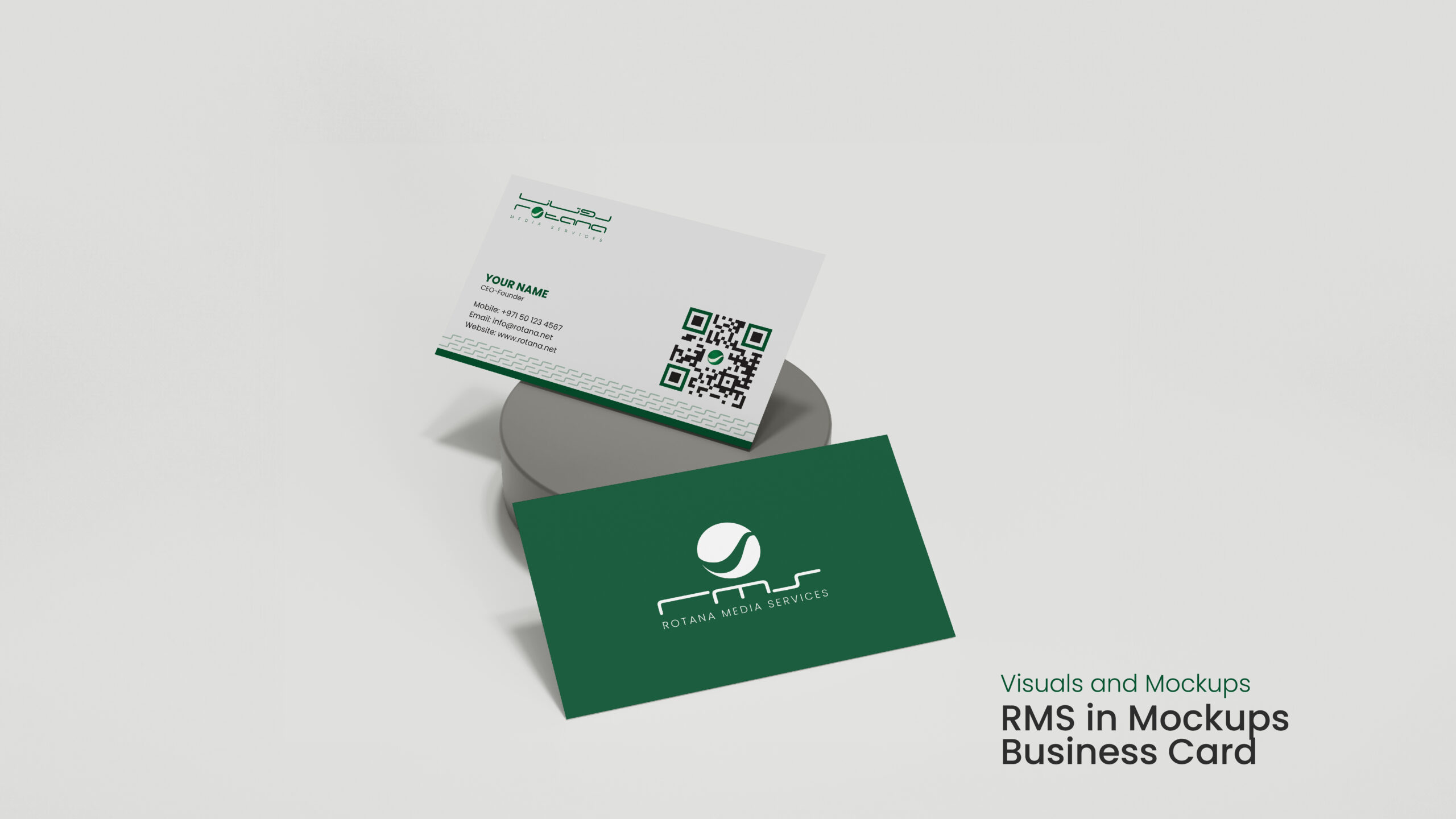
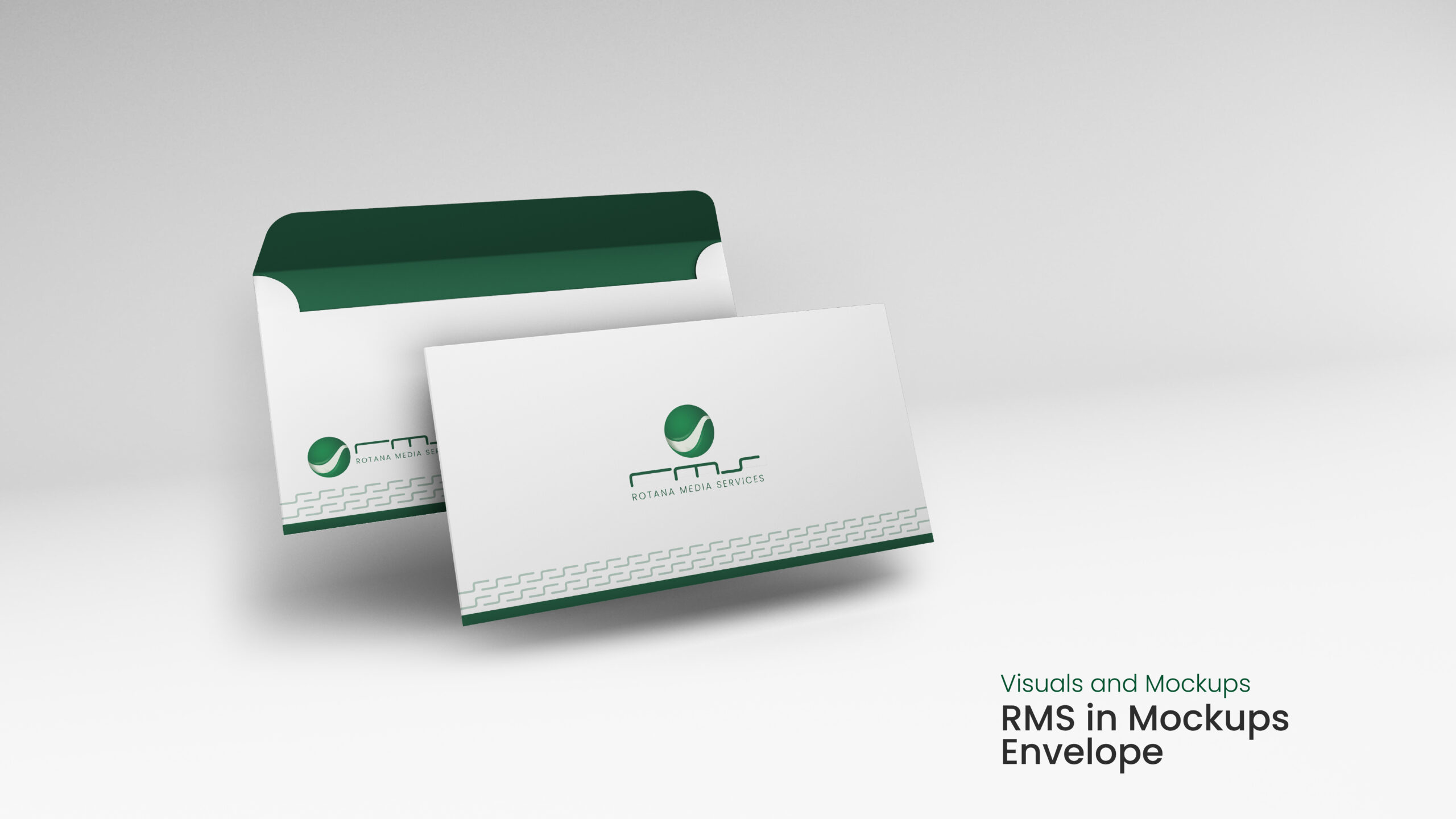
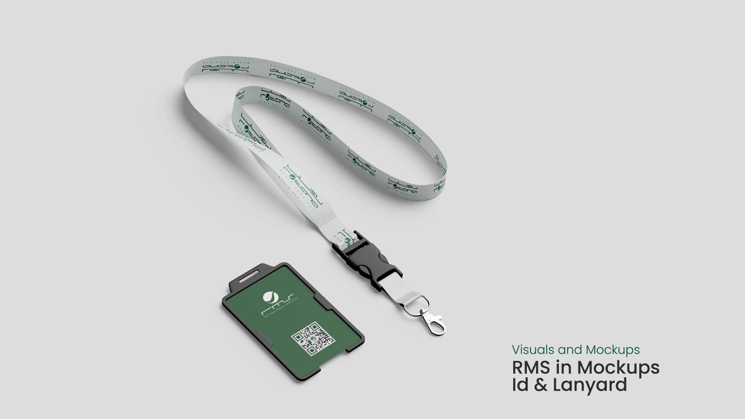
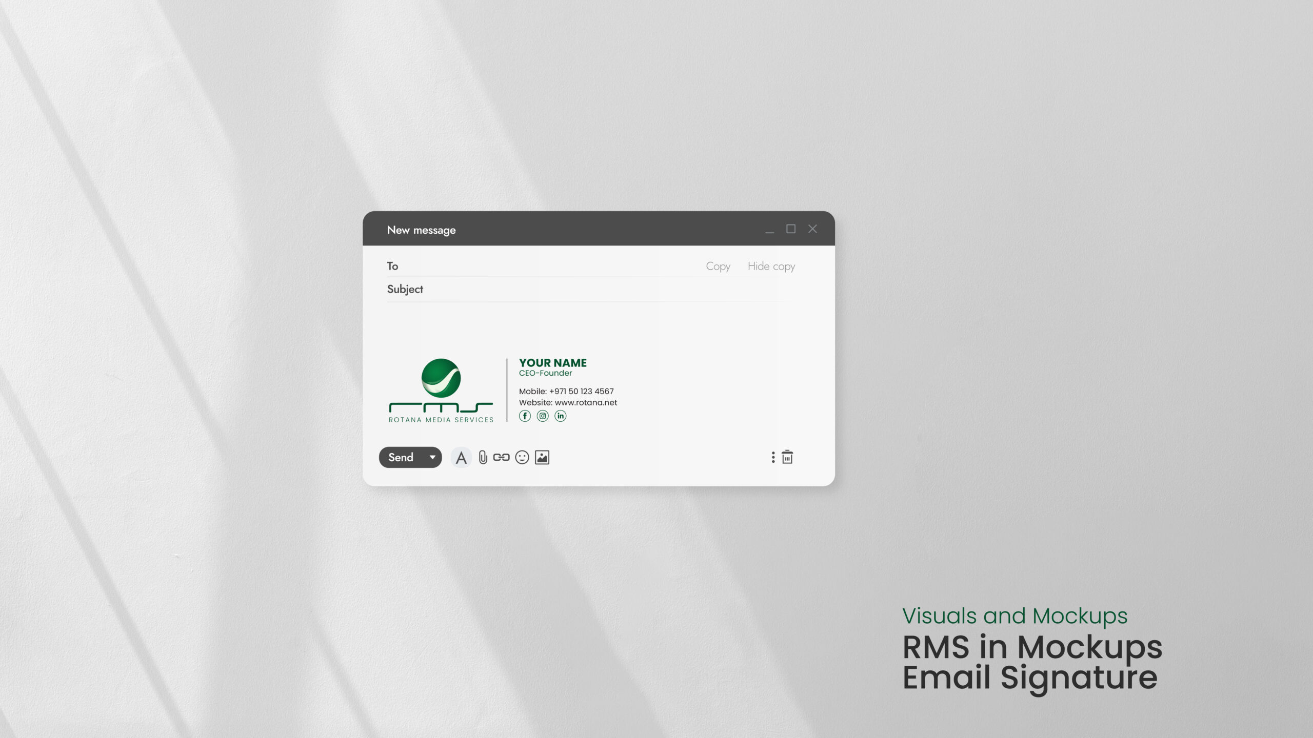
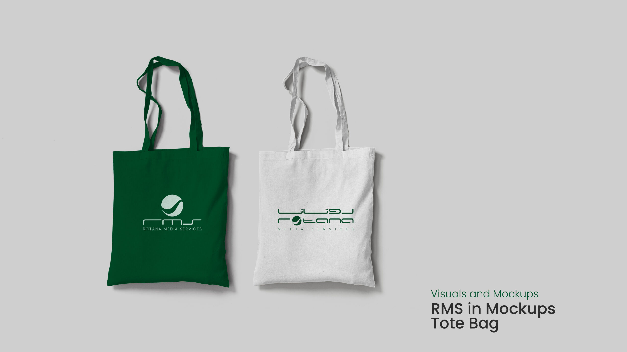
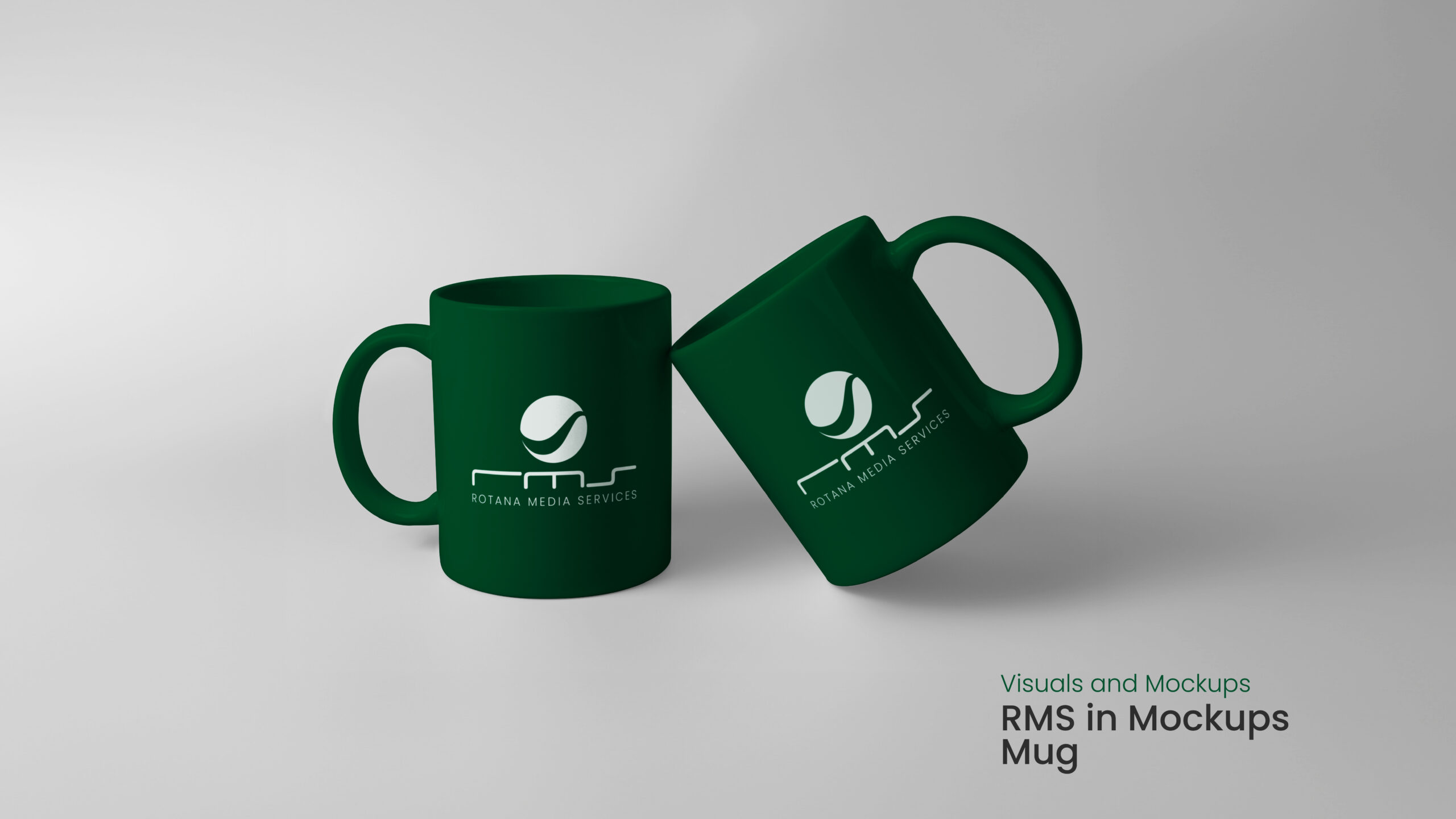
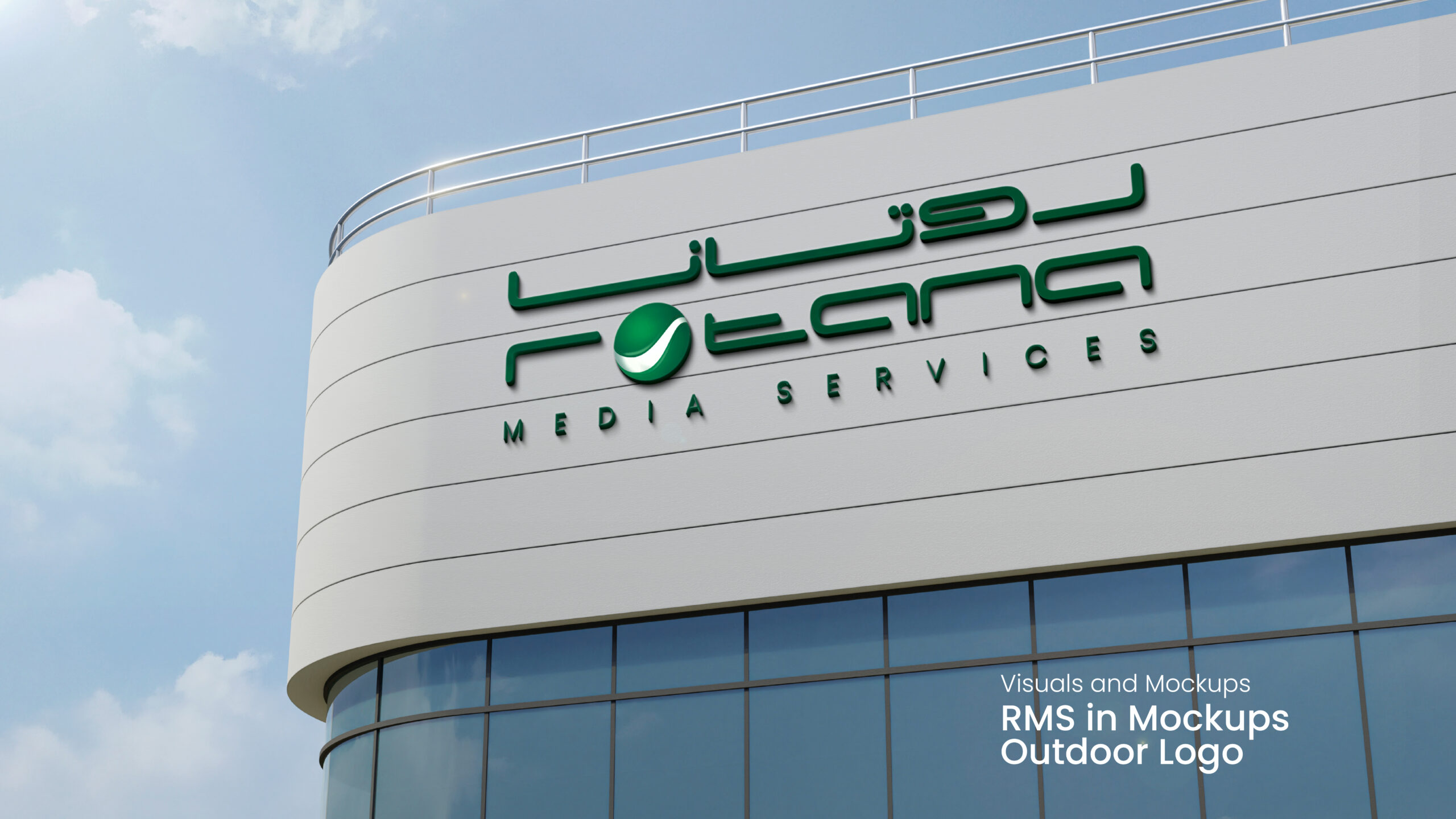
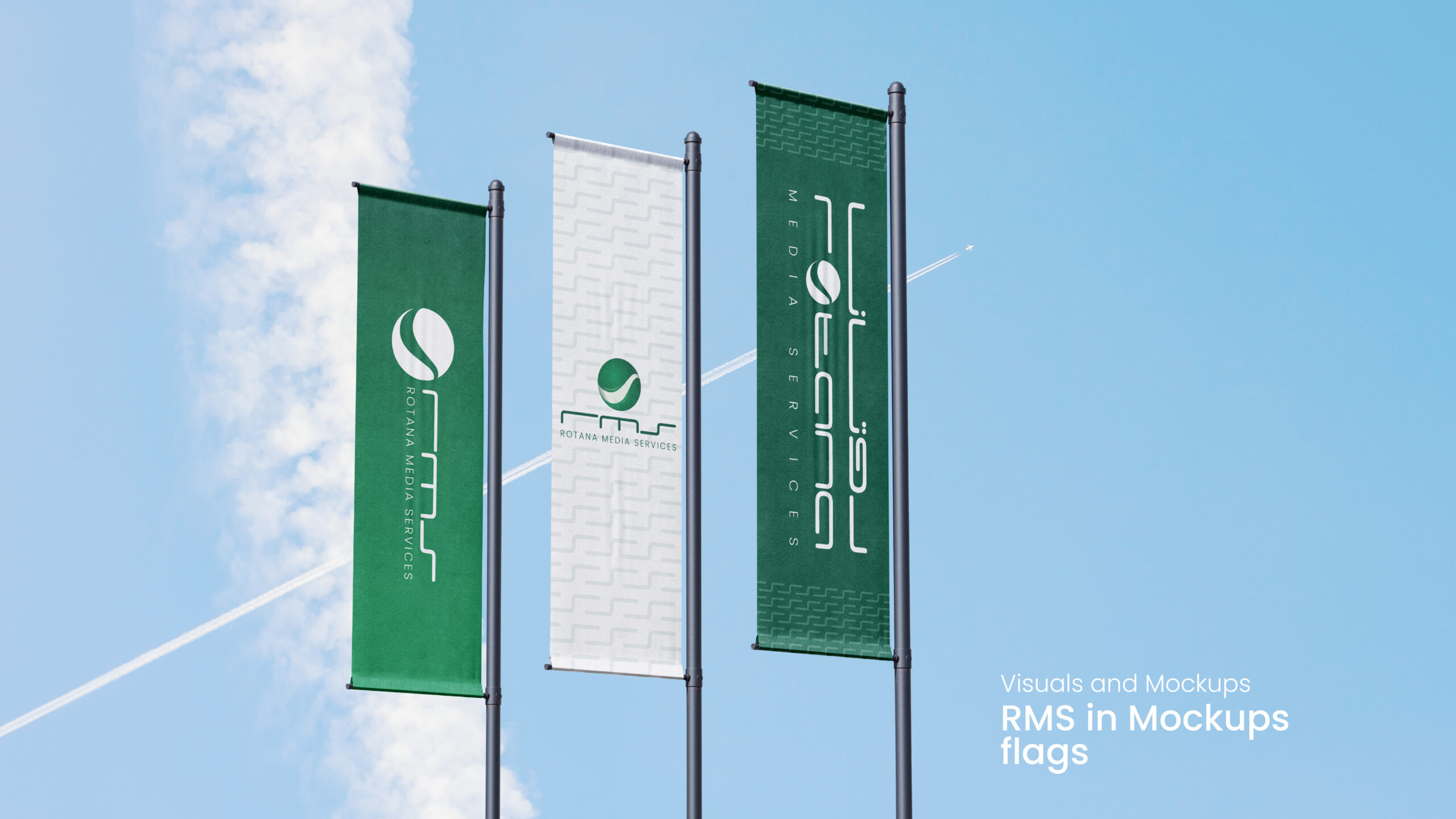
• Finalization – Delivered a polished brand package including logo assets, typography rules, color specifications, and mockups across applications.
• Concept Development – Explored multiple visual paths through moodboards and logo sketches to redefine RMS’s identity.
• Refinement – Collaborated closely with stakeholders to refine visual elements—typography, colors, and logo treatments—for clarity and impact.
• Finalization – Delivered a polished brand package including logo assets, typography rules, color specifications, and mockups across applications.
⸻
Outcome
The RMS ReBranding delivers a modernized visual identity that balances heritage with innovation. The result is a cohesive, flexible brand system that enhances recognition and positions RMS confidently for future growth.