Introduction
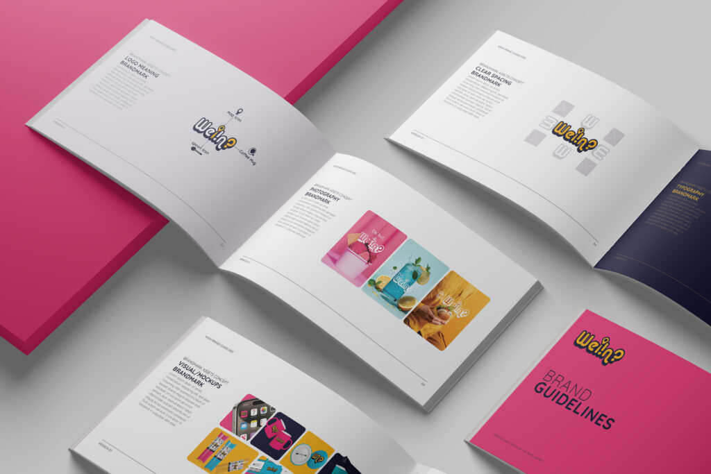
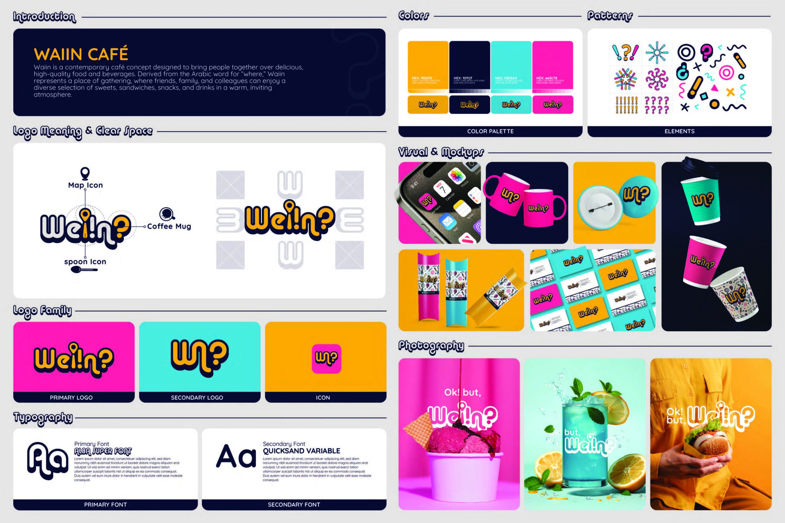
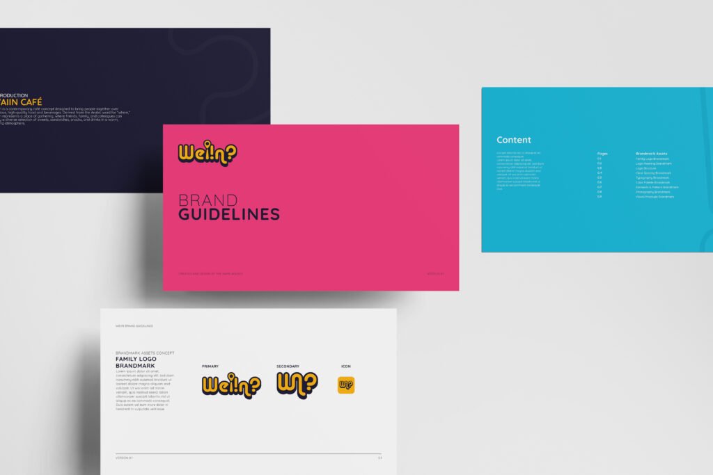
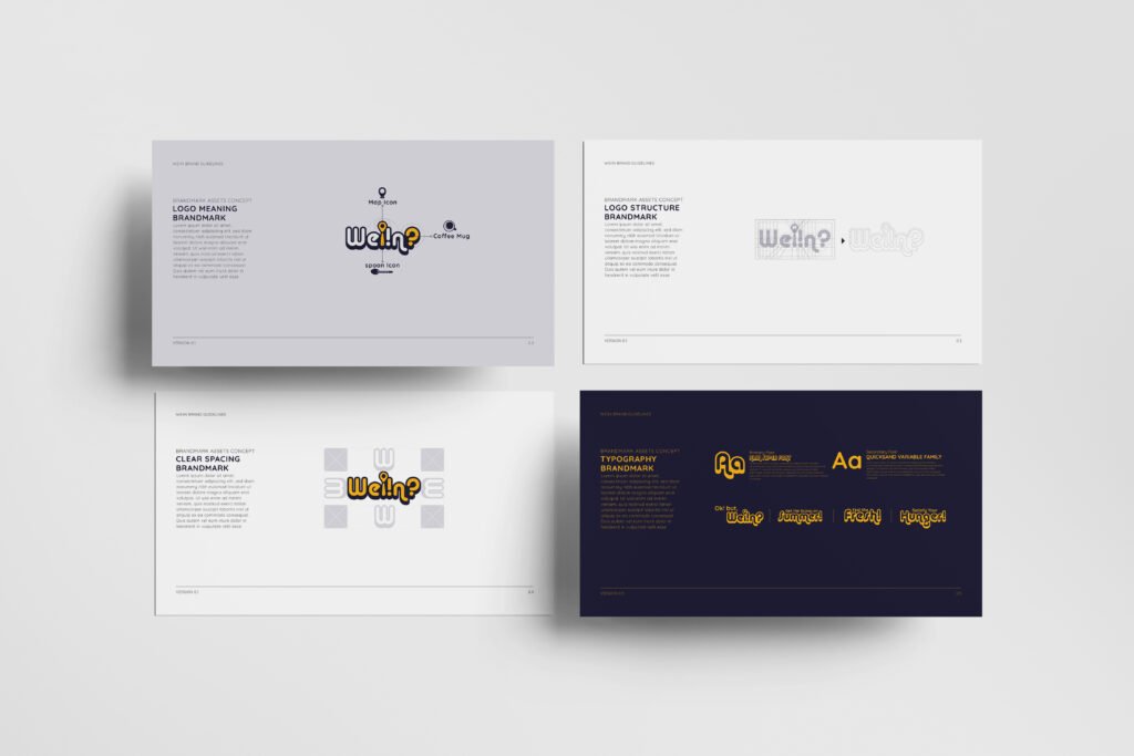
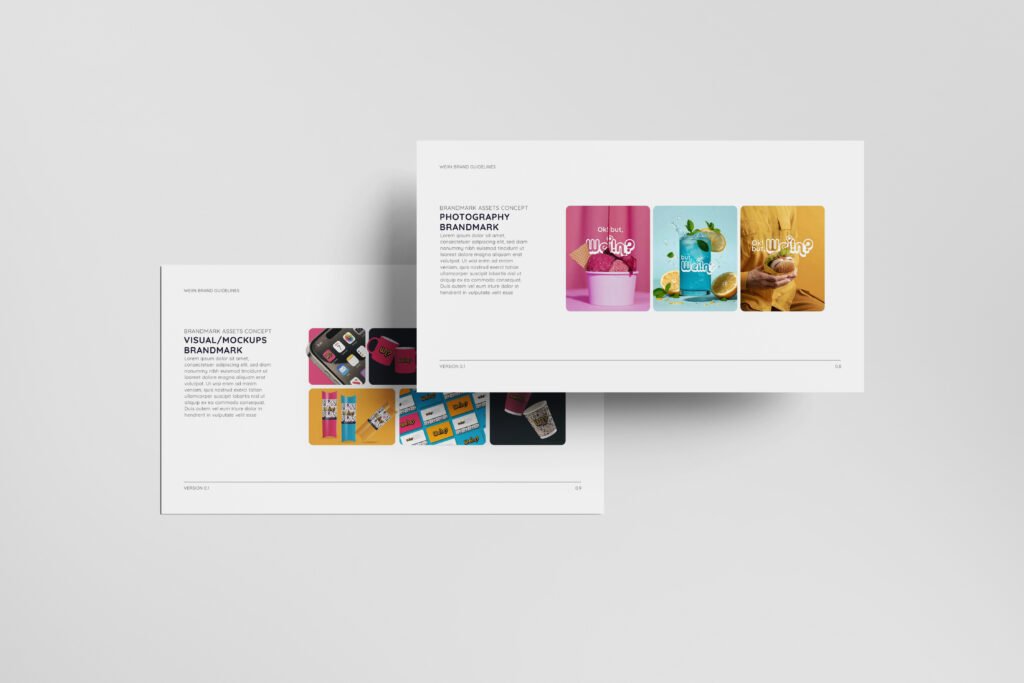
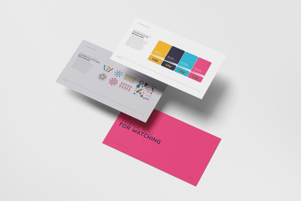
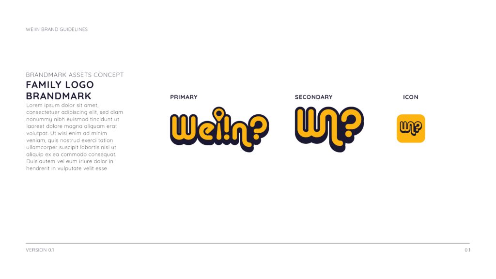
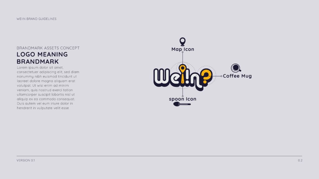
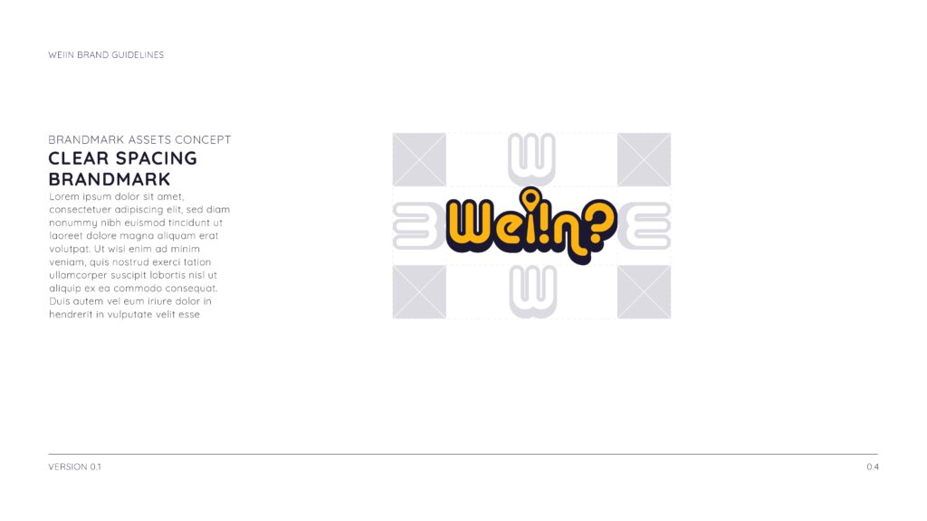
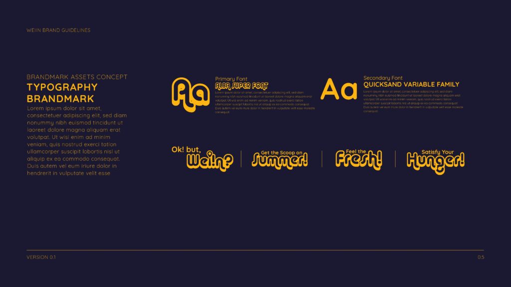
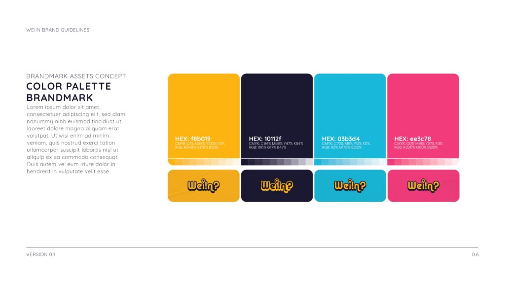
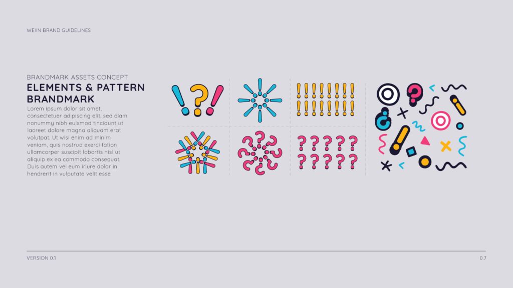
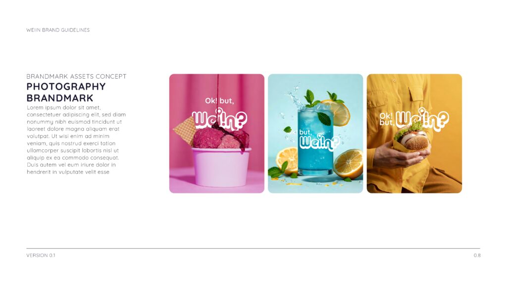
Weiin Brand Guidelines fuse timeless clarity with modern adaptability. This project established a complete visual system — from logo usage and typography to color palettes and application rules — ensuring the brand communicates consistently and confidently across all platforms.
⸻
Design Process
• Research & Discovery – Decoded Weiin’s core essence and market positioning to shape a thoughtful identity framework.
• Concept Development – Produced moodboards and sketches that explored visual tone, typography dynamics, and color strategies.
• Refinement – Collaborated closely with the client to refine visual elements, ensuring alignment with the brand’s voice and goals.
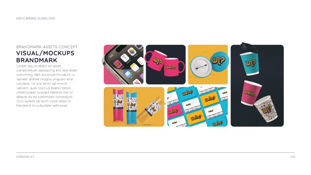
• Finalization – Delivered a structured brand guidebook — complete with logo usage rules, color hierarchy, typographic guidance, and real-world application examples.
⸻
Outcome
The Weiin brand guidelines provide a structured yet flexible visual language—empowering the brand to maintain consistency, capture attention, and grow confidently across diverse media.
